Moving Notice

Friday, October 28, 2005


Dear readers, I am no longer hosting my blog at blogspot anymore, got my own domain name and hosting - http://blog.miragestudio7.com. Please take note that I am not going to post anymore articles here, please bookmark the new address.

Here are some of the changes:
- Ads removed ( horray...) but for the moment only.
- Focusing only on art and design related issues
- Removed political and computer related articles.
- Images are all scaled down to save space
- Drop the "everyone's invited" catchline.
- Power by WordPress, more features.
- Remove all those annonying buttons, ( yeah!), for the moment only

What I hope for:
- Set up an architecture forum ( anyone care to help out?)
- Looking for contributors, email me at calvin_ngan [at]hotmail.com

I hope my architecture tutorials would be beneficial to those whom are new in architecture computing, be it architects or student. Do link me back at the new address.


Evolution of Canon

Wednesday, October 26, 2005

Who would thought that the original canon logo features buddha as a symbol. Click here to learn more.


Photoshop Fire Technique

Tuesday, October 25, 2005

Creating the fire effect from an empty new template in Photoshop seems to be almost impossible, it require a very advance level of understanding of Photoshop and with years of experience. Greg – the webmaster for photoshoptechniques.com has found the solution. Creating the Fire effect shown at the image above is as simple as abc. Go to his website for a step by step fire technique tutorial on how to create the image above.


The Mad Poet

"From the age of six I had a mania for drawing the shapes of things. When I was fifty I had published a universe of designs. but all I have done before the the age of seventy is not worth bothering with. At seventy five I'll have learned something of the pattern of nature, of animals, of plants, of trees, birds, fish and insects. When I am eighty you will see real progress. At ninety I shall have cut my way deeply into the mystery of life itself. At a hundred I shall be a marvelous artist. At a hundred and ten, everything I do - be it but a line or a dot - will be alive."

-- Hokusai (1760-1849)

Reference
- Hokusai and Japanese Art
- Hokusai


Branding Dentist Creatively

Sunday, October 23, 2005


This must be the best dentist branded in the world. Design by Leo Burnett, Germany for a dentist named Kaia. What makes this branding unique is the ability of the client to capture the spirit of dentistry. Unlike most of the architecture firm around the world, professional firms like lawyers, engineers, accountants and dentist are usually dull and lack of design concept. By branding the dentist's clinic creatively, going to one would be a fun experience.


Photoshop + Image Masking

When it comes to presentation, inserting raster images of human and trees gives it an overall feeling of liveliness. The whole idea is to counter the mono tone feeling of line drawings, especially when it comes to presenting your work to someone who is not in the architecture line of field.

I have included a few of my collection in jpeg available for download at the end of this article. Each image shows a person on a white background and another one with a cut-out version. For those who are still relatively new to Photoshop or this is your first year as an architecture student, a step by step tutorial on how to insert the image into your presentation boards is available.


(1) Select (ctrl + a ) then copy (ctrl + c) the image and paste (ctrl + v) it into the presentation board from the source.


(2) Select the magic wand tool (press W) then click on the black area, to select multiple area hold down the ctrl key and click on multiple areas.


(3) Select all of the black colour areas then delete (press the delete key) or go to "edit" then select "clear" to delete the selected areas.


(4) Deselect the area by pressing (ctrl + d) or go to "select" then "clear".


(5) In the layer toolbox, right click on the selected layer then choose "Blending Option"


(6) In layer style dialog , under the styles category select "stroke", then put the line thickness to 1. By default the colour is red, change the colour to suit your presentation boards.


(7) Resize (ctrl + t) the image to scale, go to "edit" then "transform" and select "scale"


Creating a "cut-out" or "floating image" of any of the image objects supplied below is a simple 7 step process. The step by step tutorial above gives an overview of the whole process using Photoshop. Click on both the images below for a higher resolution. For cut-out version of trees browse to the previous post - Architecture Trees Sketches


Architecture Trees Sketches

Thursday, October 20, 2005

Instead of using all those normal dull AutoCAD trees in your presentation boards, perhaps hand sketched trees might somehow break the mono tone of the overall presentation. When it comes to presentation, hand sketches and drawings are far more impressive compare to a 3d MAX rendering, after all, old is gold.

Click on the image for a higher resolution and save it into your comp. Notes that the sketches above are not mine.


Against Animal Cruelty


This is by far the best ads against animal cruelty, most of the ads in this genre are not strong enough to sent out the intended message due to the fact that violent images are not allow in newspapers. These ads are a remarkable in term of creativity, hope that this will change the mindset of those who treat animals cruelly, including those who purchase make-up or health products that uses animals as white mice. Don’t treat others the way you don’t want to be treated.

Ads by TBWA


Santiago Calatrava's Turning Torso

Wednesday, October 19, 2005


Undeniably Santiago Calatrava is one of the greatest architects to walk on this earth, a gift from god to mankind. One of his projects which is the Turning Torso caught my attention, the high rise building’s unique design consist of nice cubes twisting towards the waterfront and surrounding. Calatrava got his concept from a man’s body figure, which is explained thru his sketches above.

During my presentations, the lecturers would ask for the concept of my design, and like what they’ve always emphasize on, a concept should be something non-physical, you cannot touch nor feel it thru any physical contact. A concept should be an idea, for example concepts of my design can be axis, simplistic, cubic, deconstruction, and many more. The idea should be abstract and not take the form of an object and remodel it into your design.

Calatrava uses a man’s figure as his concept and if I were to do the same, I would have to repeat my design class for the rest of my student life. Design is all about ideas and it doesn’t matter if the end products take the shape of a man or an object, it is how well one can persuade their listeners to agree with them.

"There was a wish to get something exceptional," Calatrava said after accepting a prize from local authorities. "I also wanted to deliver something technically unique." - Santiago Calatrava

Turning Torso - Official website
Architecture Sketches - Source of information for this article


Creative Anti Smoking Advertisements

It is sad but true that the “Tak Nak” campaign is a flop, the project was awarded to Limkokwing Integrated and it was suppose to bring down the number of smokers in Malaysia. The whole idea behind the campaign is dodgy, corrupted and worst of all, awarded to one of Mahathir’s long time crony. The advertisement that mushroom all over Malaysia in the form of billboards and newspapers advertisement is an eye soar, portraying images of a young guy and girl covering their mouth, ashamed to reveal their yellow teeth. Seriously speaking, do you think smokers really care about having yellow teeth? And since when have you heard that one of your friend who smoke complain about having yellow teeth, with today’s advancement in dental care and chemical products, one has to simply run down to any pharmacy store and grab a tube of teeth whitening paste and brush their way to kingdom come.

The Marlboro man’s horse died due to excessive inhale of second hand smoke, while Mr.Joe Chemo is having lungs cancer, waiting for dooms day. These are the type of advertisement we need in the Tak Nak campaign, ads that capture audience and convert them into believers.

These advertisements were done by the One Academy’s student, a sign to all parents that when you smoke, you are killing your loves one too indirectly. The message is clear and informative and it makes you think twice before taking a puff or two.

As for this anti-smoking advertisement, I have no comment, find it kind of funny. All of the advertisement above shows a great deal of creativity, educating the public about the bad side of smoking. The anti-smoking advertisement message is clear and meaningful. That is the type of Tak Nak campaign Limkokwing Integrated should produce. Sometimes it is sad to note that RM50 million was wasted to come up with the Tak Nak anti-smoking in educating the public. It’s the people’s money and it should be put to good use, not to enrich their own cronies. I seriously hope that next time the government won’t repeat the same mistake in awarding projects, but I doubt about the sincerity of the government in cleaning up the country of corruption.


Hacking Google Adsense Program

Tuesday, October 18, 2005

Google Will Eat itself (GWEI) is the brainchild of hans Bernhard and Alessandro Ludovico, its a subversive web project that aim to fool the Google Adsense system by generating artificial hits and click in return for money.

Design to look like a professional looking website that provide realistic information, the main idea behind it is to redirect people when they are searching for information online, luring them into clicking Ads display by Google. The whole idea behind this project is to generate as much money from the Adsense program and invest every dime to buy up Google's share. In other words: Google will slowly be bought via its own advertisement-system!

Design to counter attack Google's growing grip on the information highway, the long plan is to take over Google and turn the owrnership over to the public. They claim that by doing so, they are able to deconstruct the new global advertisement mechanisms into a surreal click-based economic model.

As nobel they sound, they intend to distribute the money back to the public, which I doubt about it. It is like Robin Hood telling the public that his crime is not a sin. There are many other ways in helping out the poor using the web other than hacking Google Adsense.


AutoCAD PostScript Plotting to Scale

One of the most common questions asked by architecture students during their early years in composing their boards using Photoshop or illustrator is "How to plot AutoCAD drawings to scale into Adobe Photoshop?” This tutorial would be great for beginners.

The best way to plot to scale would be to create a PostScript files from AutoCAD via the Plot dialogue box. This requires few setup configurations to the PostScript plotter on your computer. To create EPS files, all you need to do is to add a plotter that uses the EPS format and then configure it to plot to a file rather than to a physical plotter.

AutoCAD does not automatically create the PostScript plotter for you when the software is install by default, it require minor configuration, a simple wizard that will guide you thru steps by steps.


Add EPS Plotter

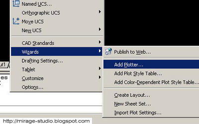
To add a EPS plotter to AutoCAD you have to use the Add Plotter wizard.

(1) Select Tools > Wizards > Add Plotter… from the pull-down menu. You will see the "Add Plotter" tab, click on it.


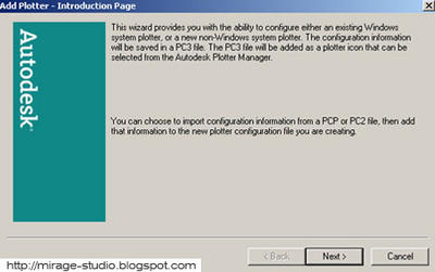
(2) After clicking on it, a dialog box will appear, which tells you a little about the wizard. Click the "next" button to continue.


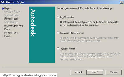
(3) The Begin dialog box will appear. This window will asks you to determine the type of plotter you want to add. Select the "My Computer" option and click the "next" button.


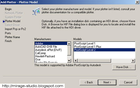
(4) The following window is the Plotter Model dialog box. Select "Adobe" from the Manufacturers list, there should only be 3 options to select at the under the "model" list. If you are not sure how the files will be used, select Level 1. The main difference would be the file size produce using Level 2 which is smaller and the support for Adobe Photoshop version 6 and above, where else Level 1 is for version 6 and below.


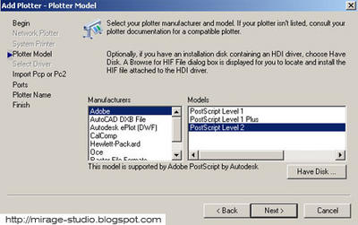
Select the appropriate model and then click the "next" button.

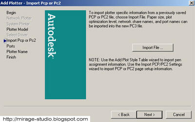
(5) The next dialog box to appear would be the "Import Pcp or Pc2". Ignore this dialog due to the fact that it is the configuration for a physical printer.Proceed by clicking the "next" button.


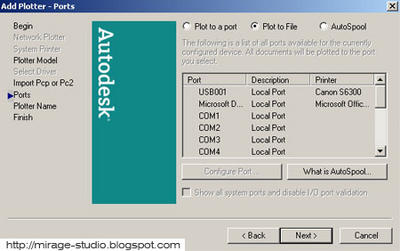
(6) Select the "Plot to File" option, this is to enable AutoCAD to plot to your computer instead sending your EPS plot to your printer plot.


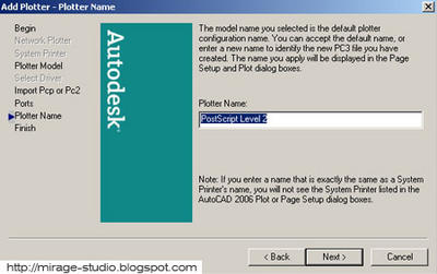
(7) Next would be the naming of the file, you can leave it default or key in the preference name. It is adviceable to leave it as is.


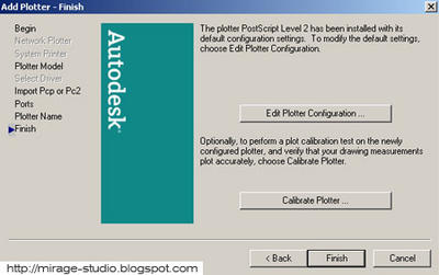
(8) The Finish page gives you the option of editing the plotter configuration or calibrating the plotter.


Checking The Plotter

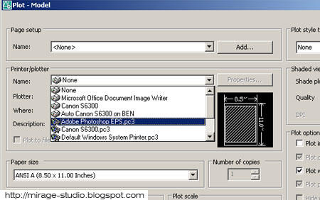
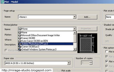
Finally, your EPS plotter should be ready for use, double check that the file is created by selecting the tab "File" then go to "Plot", from the pull down list of printer selecet the EPS plot file. With all the setting properly config, you are now able to plot to scale.


Importing EPS Common Mistake

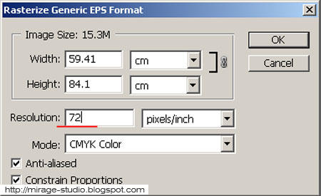
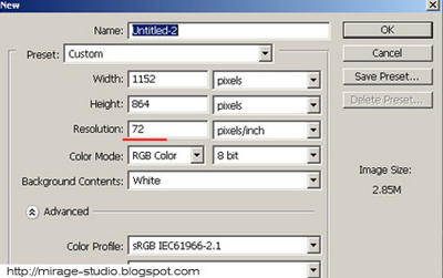
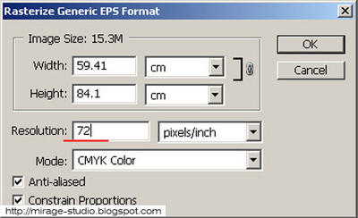
One of the most common mistake when it comes to importing the EPS file into photoshop is setting the resolution, for example if you are using resolution 100 for your presentation board, then the importing of the EPS should also be at resolution 100. Different resolution would create a different scale for the drawings in the boards. make sure the resolution settings are the same.


Technorati Tags : ,


Architecture and Furniture

Monday, October 17, 2005

Designed by Viable - a newly formed studio of London-based, they have various kind of approach towards coming out creative design. Just like architecture, furniture designing has its own set of rules and dimension to follow, and within this limitation the designer has to come up with a win-win solution. That explain why architects like Le Corbusier took the challenger to design furniture.

The image above goes to show one of Viable’s products, it is not only a shelf; the chair is somehow intergraded into the shelf. Space saving solution for a small house.

Back in M'sia, we got our very own creative team, guess what they have come up with? A bench made out of metal cage, kind of spooky right? I bet the maintenance would be way off budget when the wild grass started to crawl their way up the bench, I believe their concept in coming up with the design is "metamorphosis". As time goes by, it would eventually metamorph into a green bench. Image below courtesy of TVsmith.


Technorati Tags : , ,


Kubrick Template for Blogger / Blogspot


I was toying with my Blogger / Blogspot account and got an idea. How to implement kubrick template on Blogger? Juts for your information, the kubrick template is one of the most popular layout ever to hit the blogging world. As you can see from my blog, I've made minor modification to the kubrick template to suit my tasteless taste.

First, All you need to do is get a copy of the standard archive and place the stylesheet (wp-layout.css) and the images folder in a place where you have storage. And then replace your standard blogger template with the kubrick code. If you are not publishing to the place you placed the files, you will need to look for the references to <$BlogURL$> and point to the proper locations.Customize at your leisure and/or you may also wish to try the kubrick code that I’ve modify. Click here to view the modify version of the kubrick layout

Some of the Modification
- Added Google search tool bar
- Added sidebar on all itempage
- Remove border for images

The Navbar located at the top of your blog is disable my default, there are many other ways to disable the NavBar, but I highly recommened that you re-enable it by modiflying the code, now the reason why I did not enable the NavBar due to the fact that many bloggers out there find it annonying.

For those who still don't know what a NavBar is, look at the top of my blog you will also see a Blogger bar running on top which provides a Blogger Logo to show your blog is hosted by Blogger, Search tool for your blog posts, 'Blog This' to quickly publish new posts, 'Get your Own Blog' in case the surfer wants to get his own blog on Blogger and 'Next Blog' which provides a means of interlinking different Blogger Blogs. This Blogger Navbar can be customized so that you can select different colors to suit your site content to Blue, Tan, Black and Silver.

So before you proceed and install the kubrick code or templates with the Blogger scripts, please read the Blogger terms of service to see that they are not violated in any way. To enable the NavBar again, follow the step by step procedure below.


Gradient Masks over AutoCAD with Photoshop

Sunday, October 16, 2005

When it comes to architectural presentation boards, CAD programs fall further behind expectations, more and more people are using other software tools to create their presentations that meet their needs. Adobe's Photoshop and Illustrator are some of the most popular tools when it comes to preparing presentation boards. If you have not use either one of these software to enhance your presentation boards, then you must be missing something. In this article, we will look at one of the most common effects architecture students and illustrators love to play with but find difficult to figure out: the Gradient Mask.


In order to blend both of the images, you have to export them in the same exact view. To capture both views you can use any CAD software offers, In AutoCAD and Architectural Desktop, you can Plot a Hidden Wireframe to a .tif file and Render to a .tif file format as well to get really high resolution images. (click on the image below for a larger resolution, then save it into your comp for tutorial )


With both the images from your CAD program, import them into Photoshop and put them on separate Layers. Typically I like to put the Wireframe on top of the Shaded or Rendered image but it is not necessary to follow my preferences.


Align the images by adjusting the Transparency Bar on the top Layer so you can see both images blended at the same time. Zoom in to match the Wireframe up against the Shaded or Rendered image. After the alignment, please remember to set the opacity back to 100%


After adding a Mask to the current selected Layer, use set the Paint Bucket tool to a Gradient tool and make any adjustments you see fit. The Color should be set to Black. You can always adjust the falloff of the gradient by double-clicking on the gradient drop-down.

With the Gradient Tool set, select two points across the image and withness the gradient results immediately, illustrated example can be seen at the image above. If you increase the distance the falloff should be stretched and less drastic while decreasing the distance should create a dramatic falloff as illustrated to the right. Recomended to use the Shift key while drawing the gradient line inorder to create a straight gradient.